Our updated site offers new Tableau dashboards for more than 60 performance indicators. Data tiles provide a high-level view, while the dashboard allows users to see expanded demographic breakdowns, easily compare performance by metro areas, and see trends over time. Customize your data query to best suit your organization’s need, and export graphics from the dashboards to make compelling, data-oriented visualizations to drive decision making.
Interactive Dashboards
Make the Most of the Data
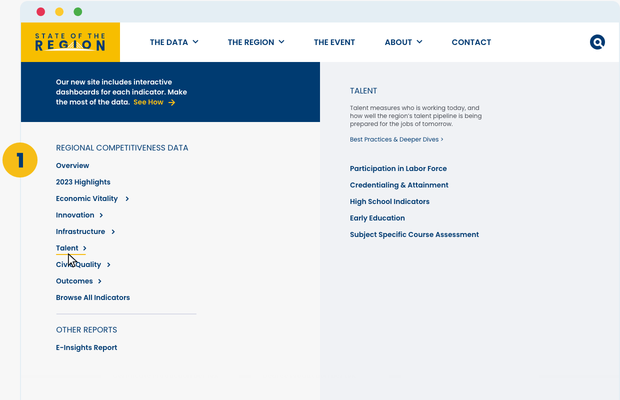
Navigation
Use the menu to see all data drivers, groupings, and indicators, then navigate to a group page to explore in more detail.
- Go to ‘the data’ tab and choose from one of the 5 drivers
- Click on a group name to see a list of indicators
- View the group page, which has a quick view of all its indicators
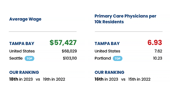
Data Tiles
Each data tile presents a quick-read reference for the indicators in each grouping. It shows the indicator name, our region’s absolute value for that indicator, comparative data for the US (when available) and top performing market, plus Tampa’s ranking among the cohort as well as last year’s ranking for comparison.
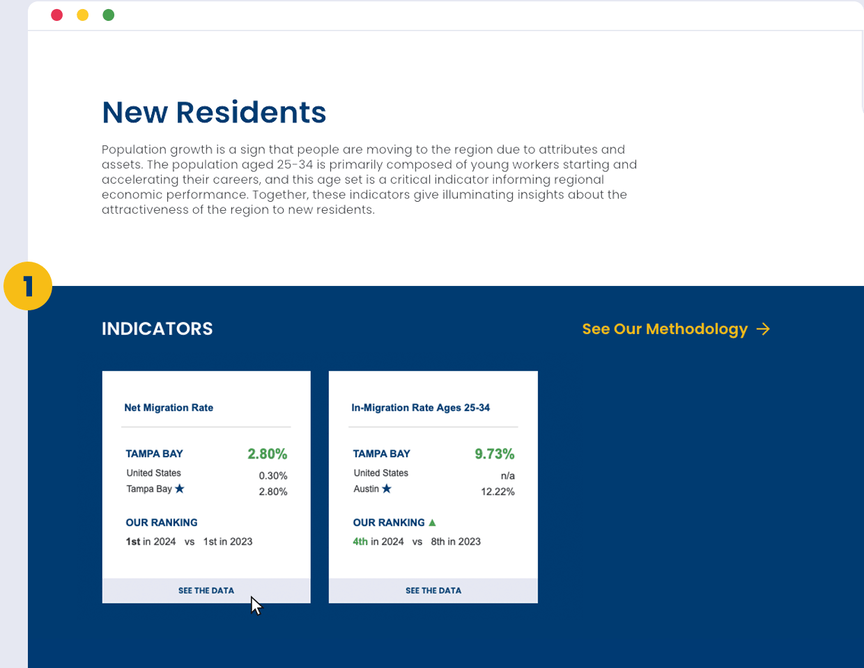
Data Dashboards
Every data tile can be expanded to show a more comprehensive dashboard for each indicator.
- Click ‘see the data’ to open the data dashboard for any indicator on the page
- See expanded breakdowns, comparisons, and trends over time
- Take advantage of comparison and download features